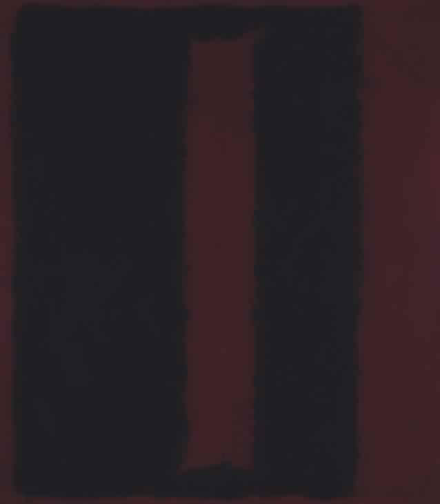
When I was studying art in college, one of the first things we were taught when painting, was not to use the colour black, to mix it instead. Straight, pure black that comes out of a tube of paint is extremely strong and when used as shadows or dark places within paintings and alongside other colours actually zaps away these colours or soaks them all up. Leaving a very dull colourless painting devoid of the levels and tones you get from, well, colour. By mixing a very dark shade, usually from a combination of other colours you are using, (dark blues, greens & reds combined make good faux blacks), you keep colours and avoid zapping the painting of tone.
It's not only this but in real life there's not a great deal of this pure black, (or super black as Ben dubbed it which I quite like). Light for the most part is around you and reflecting off things, even black things, meaning it's not super black. Also things you may think are black are not black. Both of my sisters, unlike myself, have straight, panten pro v, dark brown hair, in some cases some may say black hair, but in fact it is just very dark brown. Beetles, they're pretty super black, until you look a little closer and in fact they reflect like an oil slick.
So what relevance does any of this really have? Aside from me wanting to write about it because one I'm painting again and two I'm just generally really into colour, we have managed to mass produce super black on the very thing you're looking at right now. It's easy to emulate super black on a screen, however, you should be very wary about doing so. Back at a conference in the autumn, a designer showed me their latest design. It was a good design, however without trying to detract from it, my feedback was to not use super black and, in fact, the super white they'd chosen, off set them slightly, just like you wouldn't use super black when painting. I call this the Apple effect; that almost upgraded posher feel you first got from using OS X or iOS can be put in part to the interfaces not being super black and super white. They're offset slightly. I've always coded designs with offset blacks & whites - made easier with preprocessing:
// use super black or white
$black: lighten(#000, 2%);
$white: darken(#fff, 2%);

// or darken/lighten your main design colour
$black: darken($mainColour, 40%);
$white: lighten($mainColour, 60%);
As with all rules there are exceptions - without breaking this one we would have never got these wonderful paintings.