I thought I'd document how I usually go about deciding on colours for a new website design.
I'm currently working on a personal project and have already put together some interactive wireframes using my White Paper (link coming soon). The next stage for me is to decide on some colours and fonts which I will then integrate into the wireframes and go on designing from there.
For this project I only have the subject matter for inspiration. Usually I would have a fair idea of look and feel in my head before I start looking for colour influence. However this one is very much an open book.

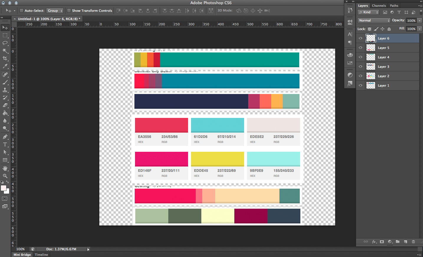
The first thing I do is turn to Colour Lovers and have a browse through the palettes on there, searching with keywords as I see fit. I screen shot any palettes or colours I am drawn to. I then put all these into one file in Photoshop.
From there I can start to see common colours, what I like, what I don't like, things I have maybe been drawn to before (for instance the third palette down looks a lot like the colours for this site!).
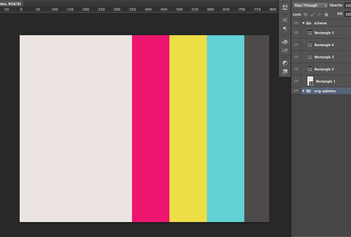
The next step is to use the shape tool (U) to draw rectangles which will make up my palette. The shape tool is a good choice as you can edit the colours easily via the Layers Palette. The size of the rectangles is relevant too. As I am going for a light look (with a pale background) rather than a dark look, I will make the dominant light coloured rectangle larger.

I try to have at least one very light colour and one very dark colour per scheme, as I've found this helps dramatically when colouring text with enough contrast (as well as any other contrasting elements in your design, like shadows, borders and backgrounds).
I then create other same size rectangles for the schemes other colours.
At this point the colours aren't too important, as it's easy to edit and change them. Which I will evidently do as the design progresses.

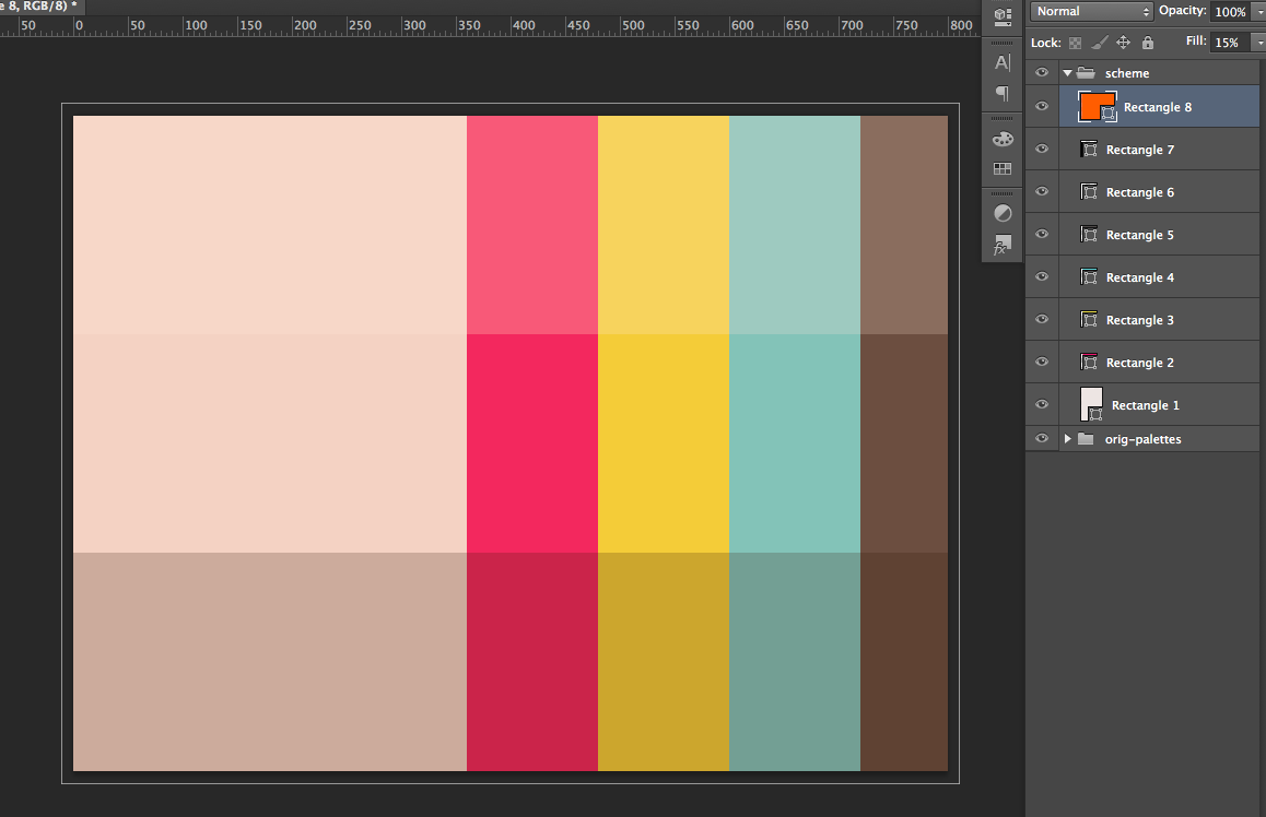
The next thing I do is add three more rectangle shapes. One over the top third of the previous rectangles with a white fill of about 10-30%, one over the bottom third with a black fill of about 10-30%, and one over the entire piece with a colour fill of about 5-30%.
The white and black rectangles are pretty self explanatory. They provide lighter and darker shades of your colours, not only for use but also so you can get a better sense of the colours you've chosen.
This final rectangle I find important. It acts to converge all the colours and give them a sense of belonging. For instance if I chose a medium blue at 5% it would cool all the colours and give them a slight sheen, if it were a bright orange it would lift the entire palette and warm it up. Or if it were a grey it would desaturate the palette slightly and almost matte it.
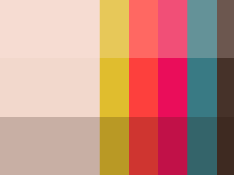
And here it is - the first draft of my colour palette for my new design. The next thing to do is to get it into a browser, as no doubt it will change and develop after I start designing. I must remember to post here what makes the final cut 😃
